
Primari
Overview
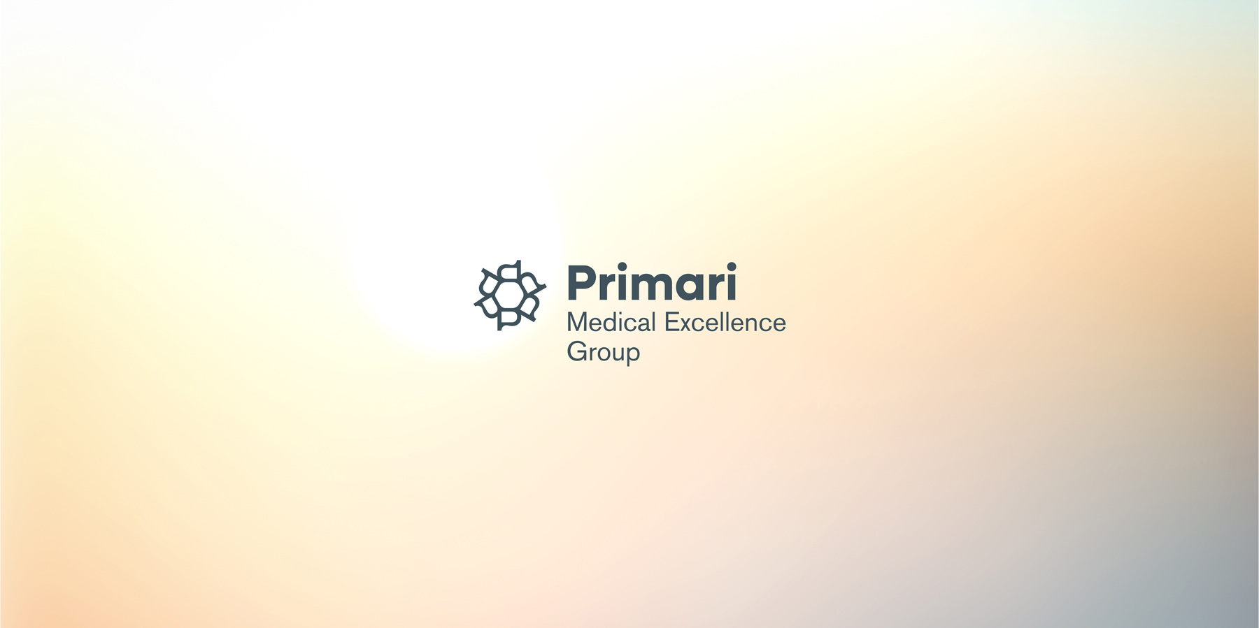
Partnership at the Core of the Brand. The brand strategy established partnershipas the foundation of Primari’s relationship with its patients. Medicalexcellence, an interdisciplinary approach and a high standard of care werecombined with a philosophy that sees the patient as an active participant intheir own health. This positioning informed the entire brand,from its name and verbal communication to the visual identity and the wayPrimari presents itself across different communication channels.
Primari. The name Primari draws its inspiration fromthe Latin word primarius, meaning first, leading or distinguished, combinedwith RI, a reference to Rijeka and the brand’s place of origin. Concise and distinctive, the name reflectsthe ambition of medical excellence expressed through the brand category MedicalExcellence Group, while its structure makes it equally relevant andrecognisable in both Croatian and international contexts.
Approach
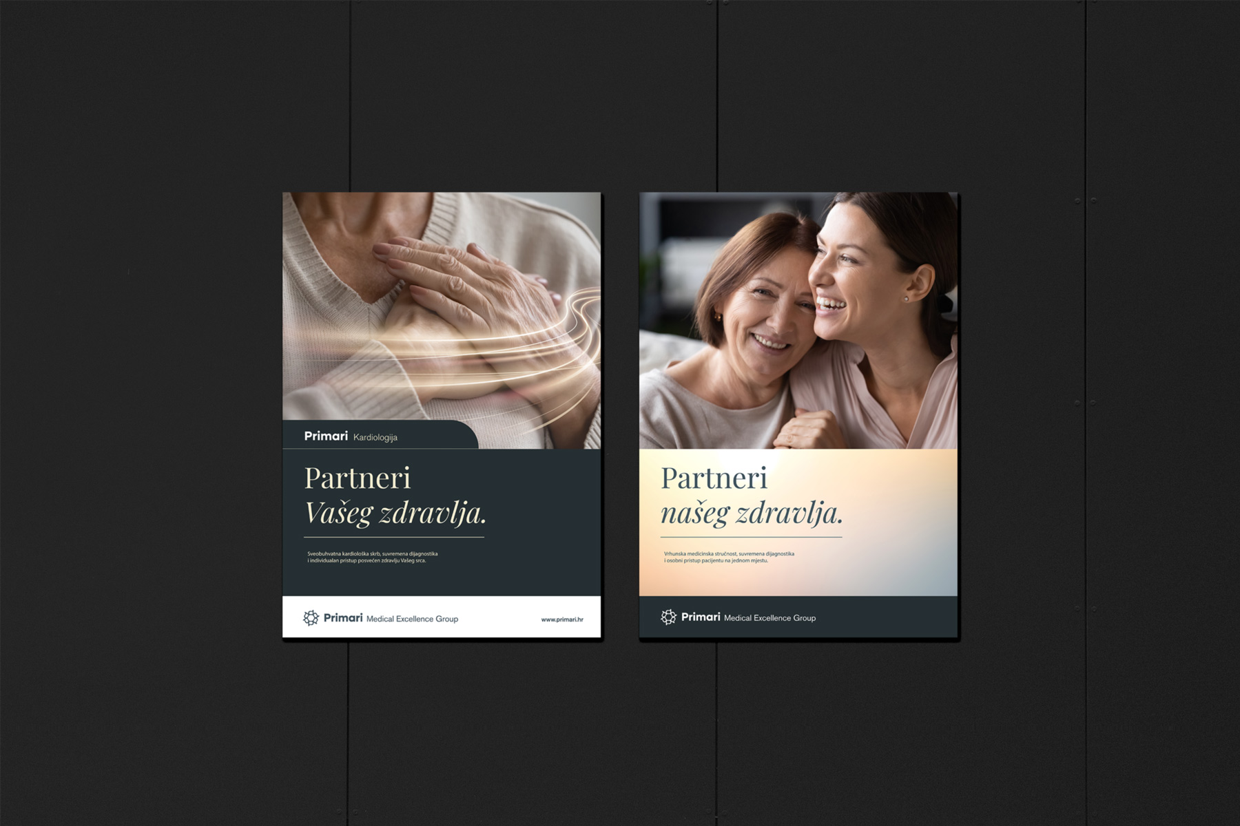
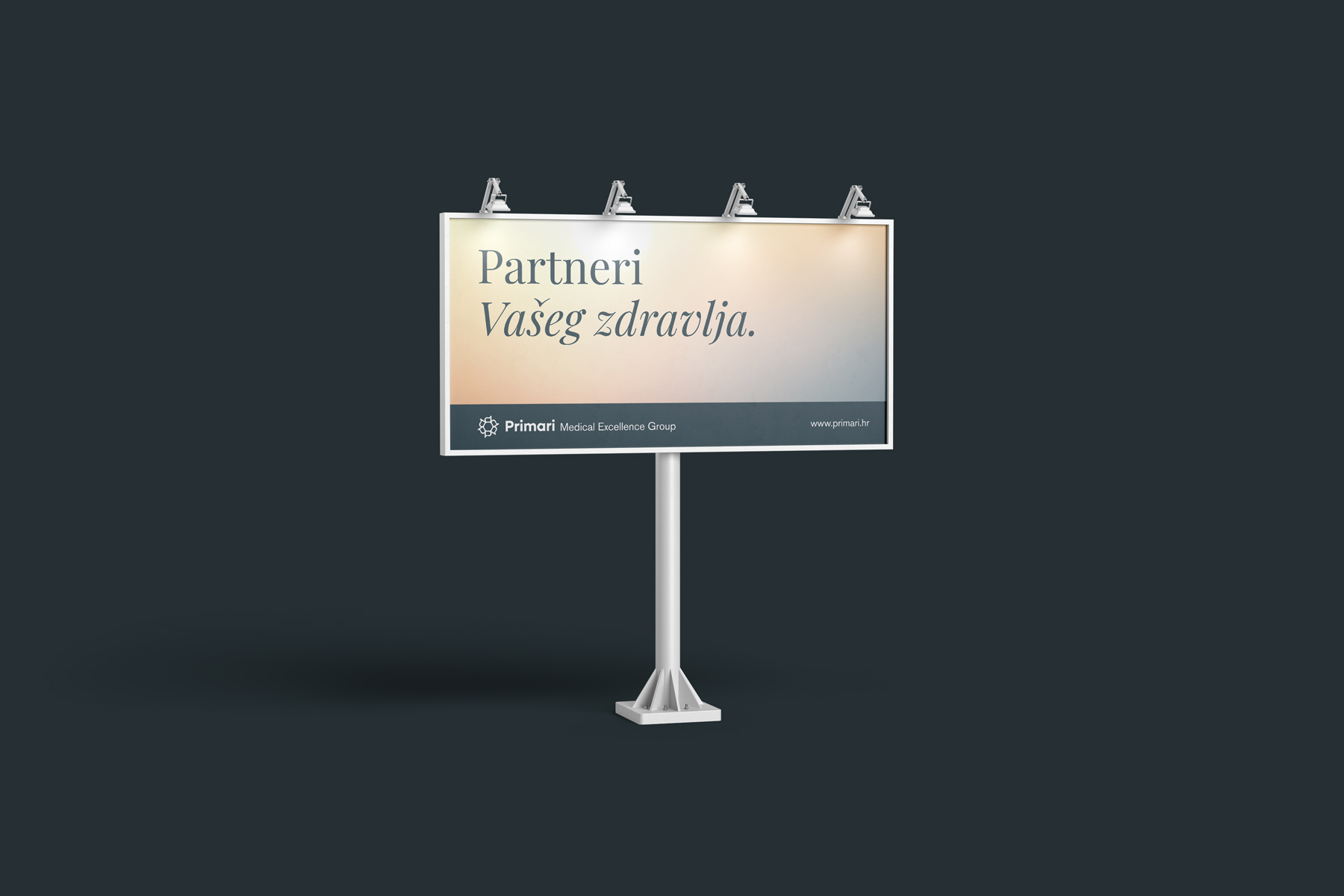
Partners in your health. The tagline Partners in Your Health. stemsdirectly from the brand strategy and defines the relationship Primari aims toestablish with its patients. Rather than focusing communicationexclusively on individual medical services and specialisations, the verbalidentity emphasises continuity of care, expertise and the relationship betweenpatient and physician. The tagline serves as a concise expressionof the brand positioning and provides a foundation for Primari’s widercommunication.
Visualising Partnership. The visual identity originates from theinitial letter of the Primari name. By rotating and connecting the letter P, acircular form emerges, suggesting people joined together and translating thecentral brand idea into a distinctive symbol: partnership between patients andmedical professionals. The circular structure also reflects theconnection between different fields of medicine within an integrated system ofcare. Its geometric and modular character allows the symbol to functionindependently, as part of the logotype and throughout the broader visualidentity.
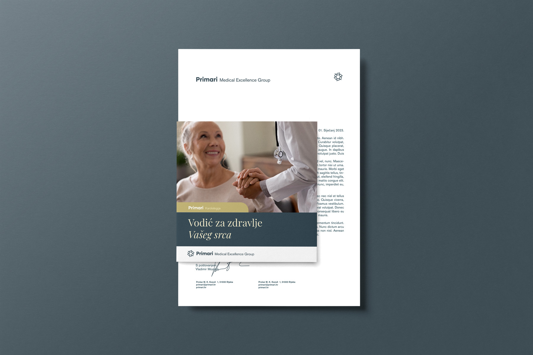
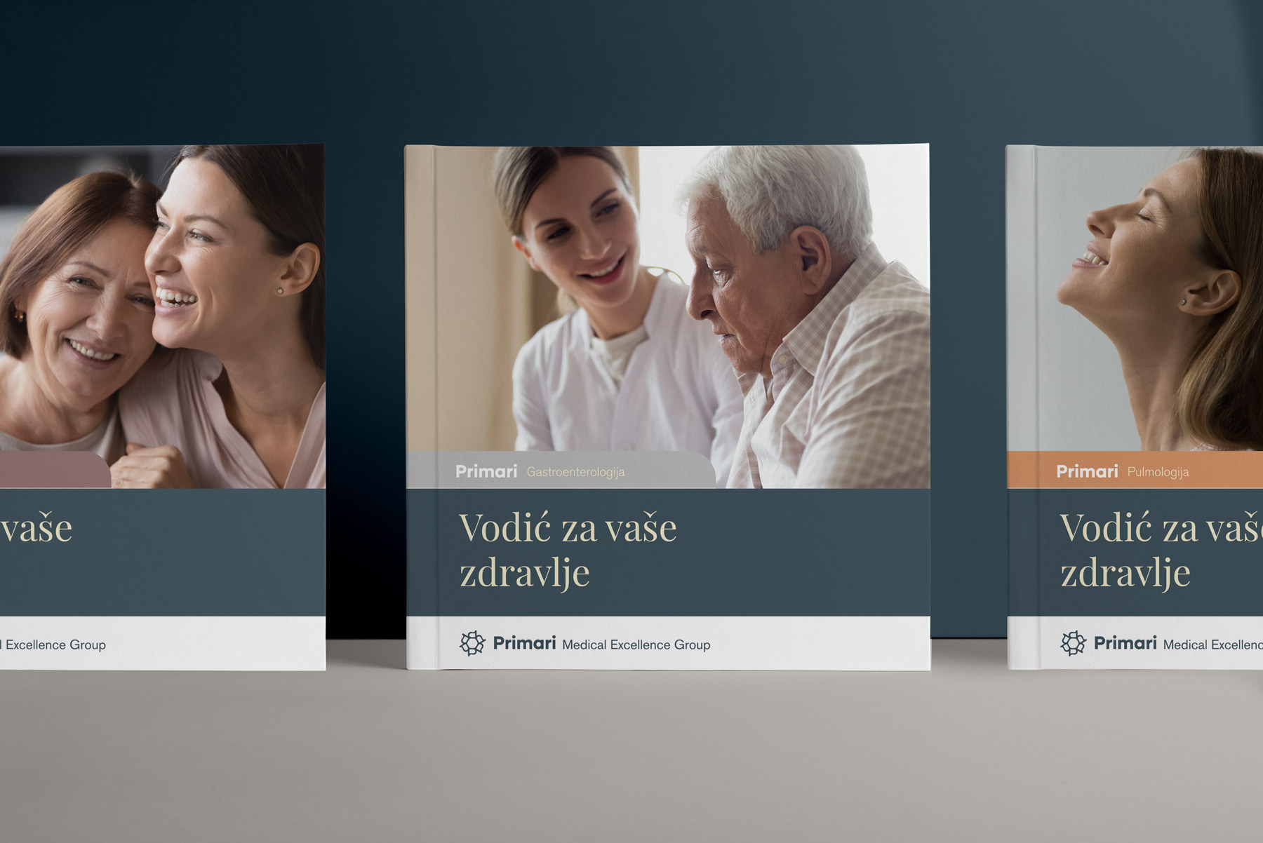
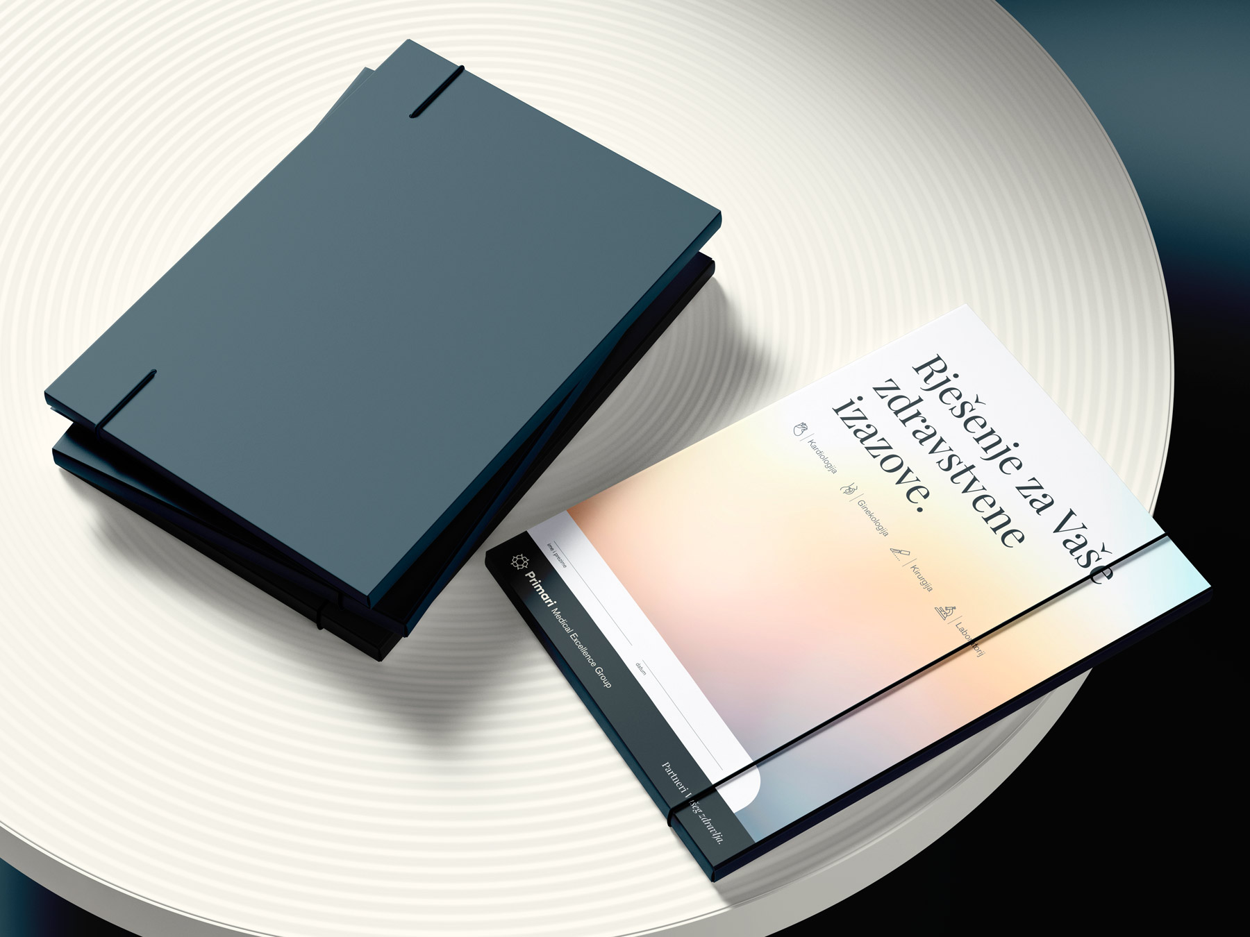
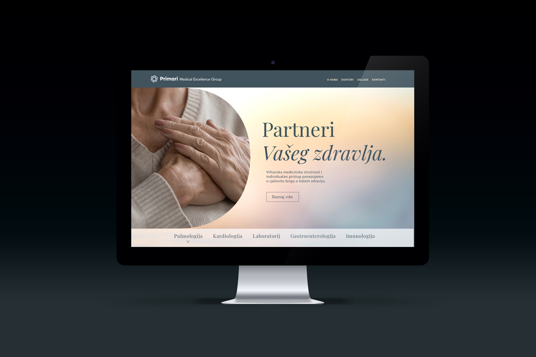
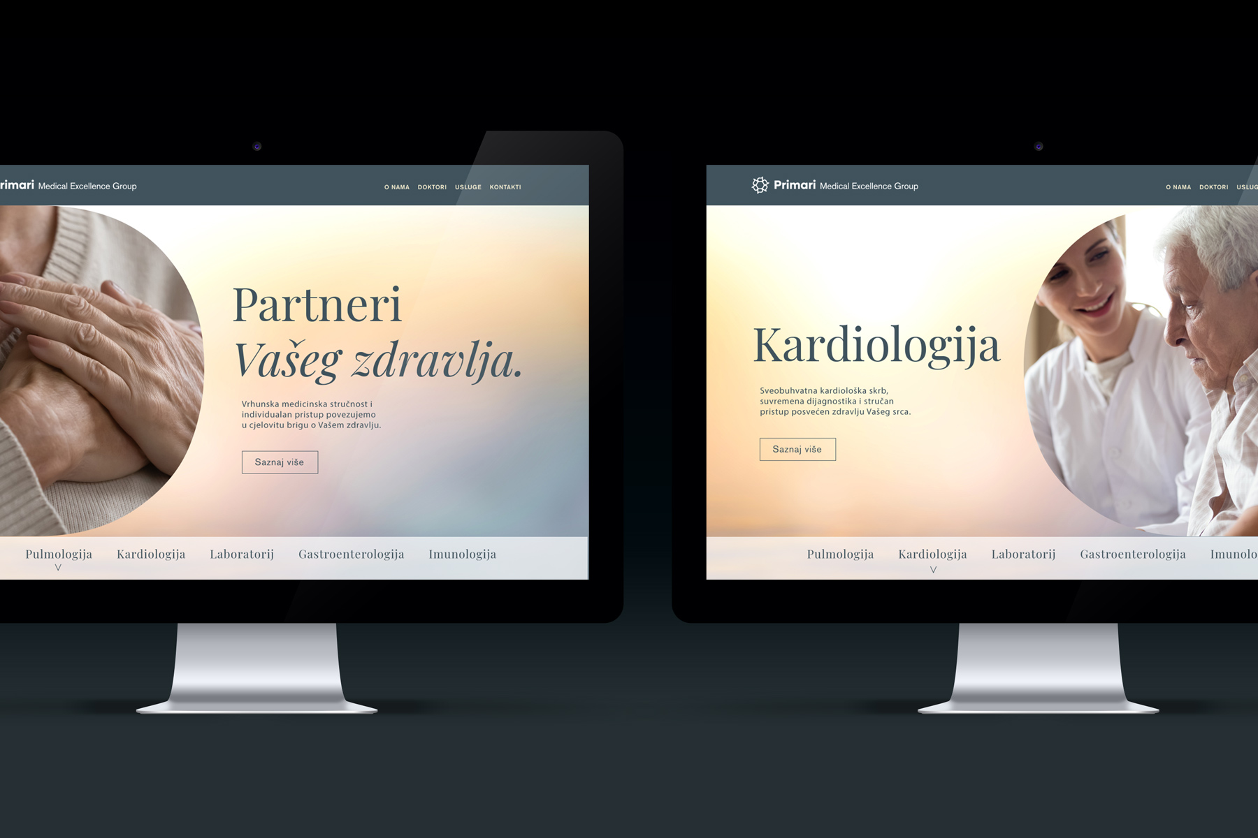
Primari’s visual language was developed tobalance medical expertise with a sense of approachability. A deep blue grey provides a stablefoundation for the identity, while subtle gradients of light and warmer tonesintroduce a sense of calm into the communication. Together, they allow Primarito move beyond the conventional visual codes of private healthcare whileretaining the authority and credibility expected within the sector. The typographic system follows the sameprinciple. A contemporary sans serif supports functional and informationalcommunication, while serif typography and its italic style introduce a moreexpressive quality to key brand messages. The photographic direction furtherreinforces the importance of relationships and patient experience, focusing onpeople, proximity and everyday moments connected to health and wellbeing.






Results
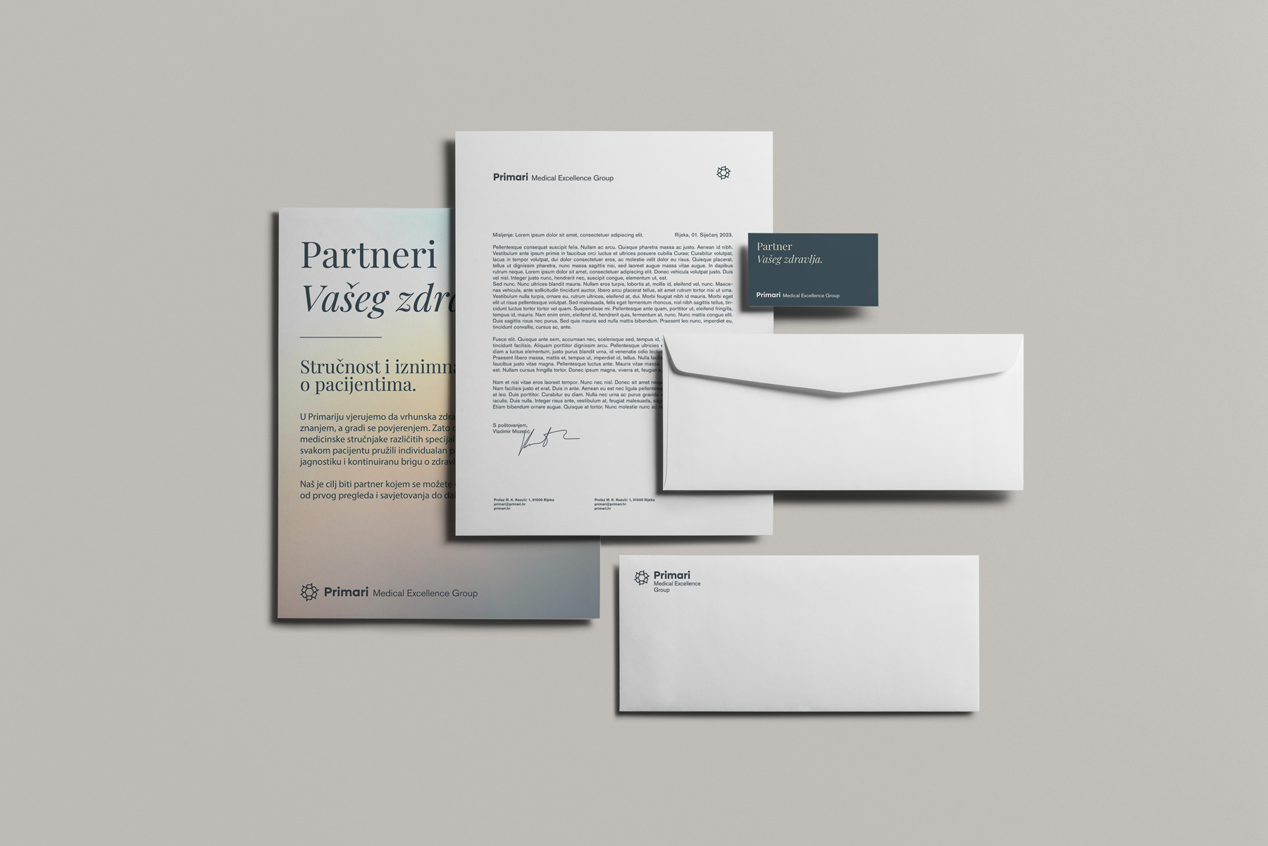
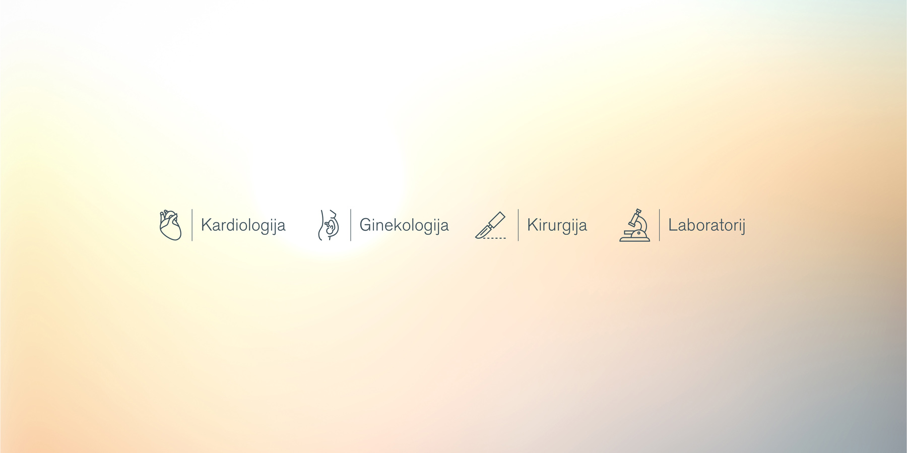
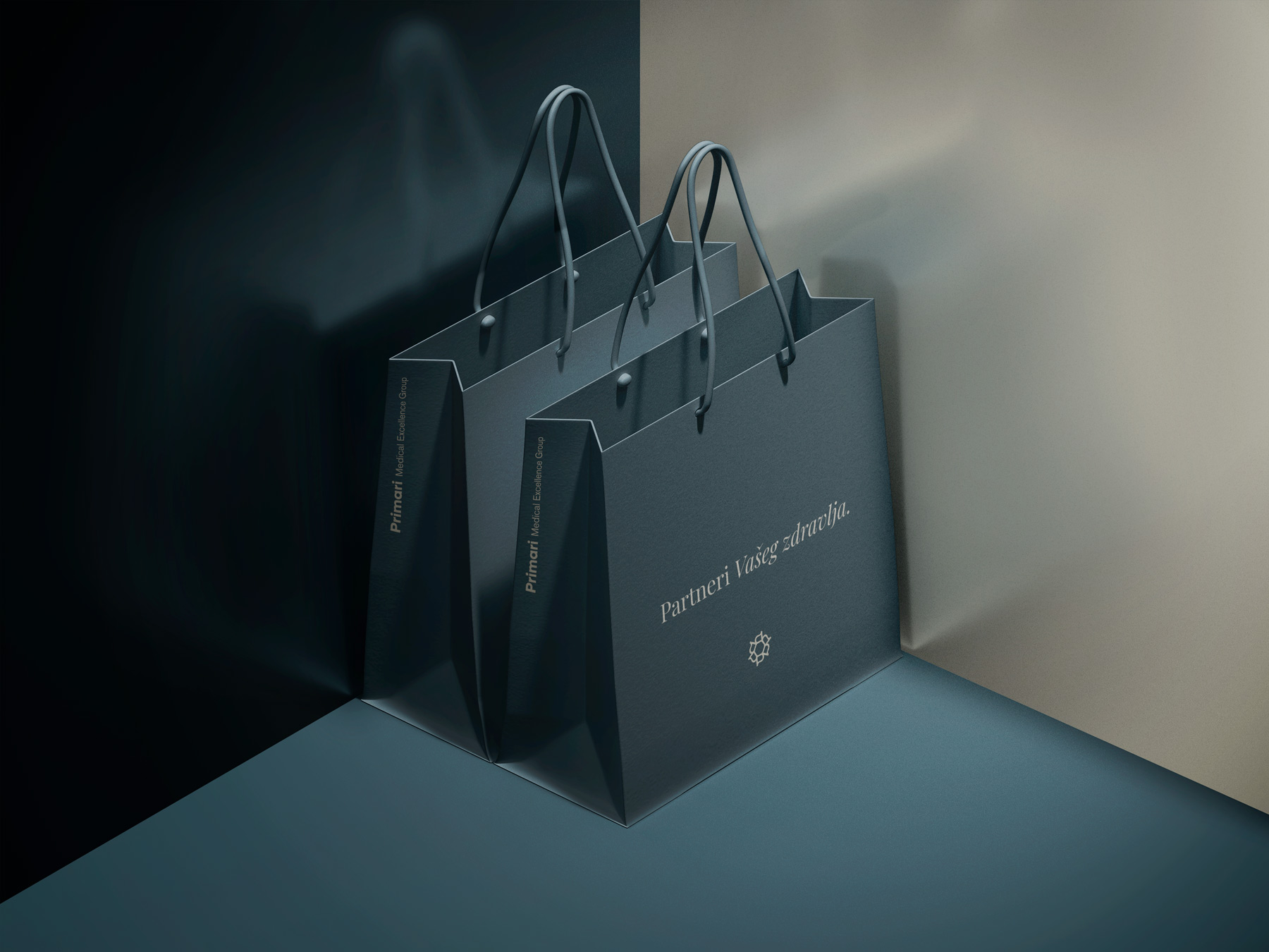
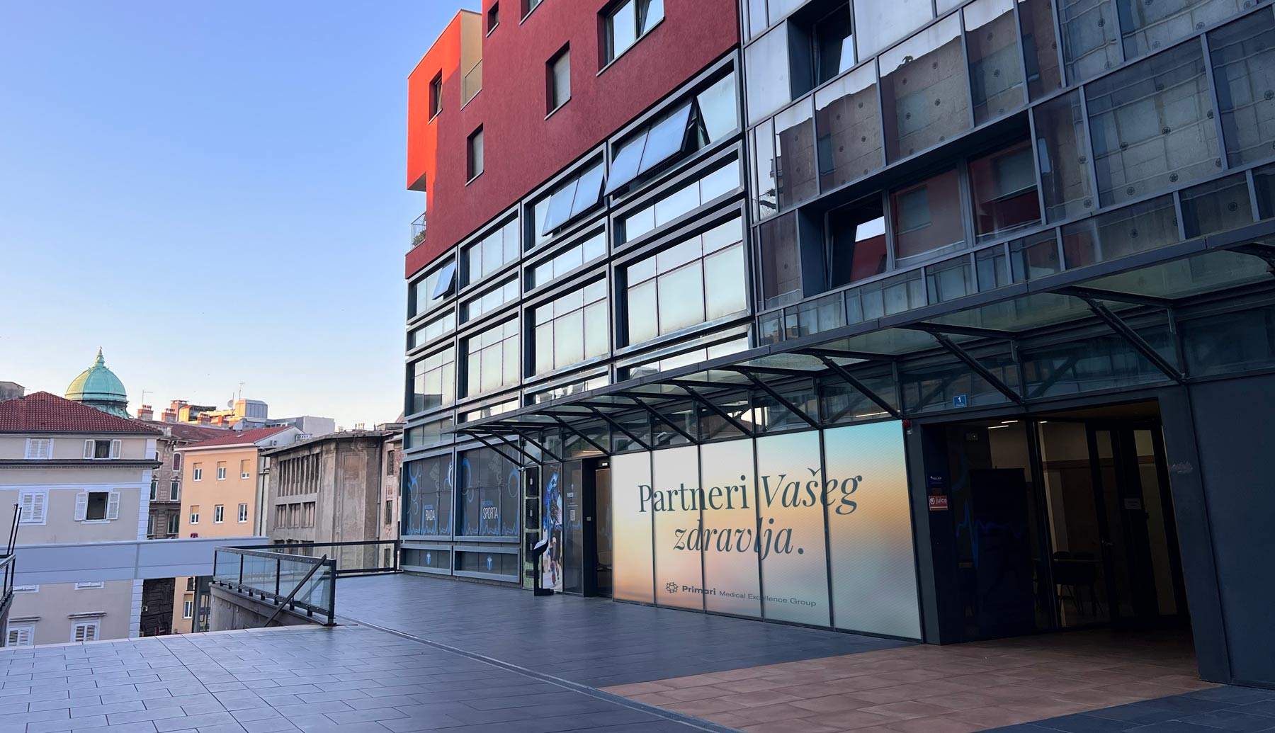
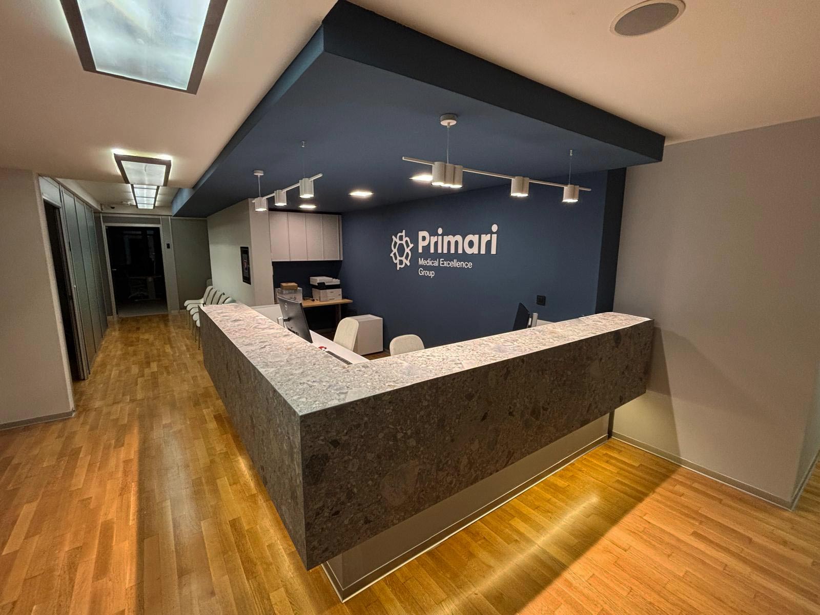
The identity was implemented across thebrand’s key touchpoints, from corporate communication and outdoor advertisingto promotional materials, health guides and communication dedicated toindividual medical fields. The flexible visual system enables Primarito continuously introduce new content, services and specialisations whilemaintaining a consistent and recognisable brand identity. In October 2026, Primari Medical ExcellenceGroup officially opened its doors in the centre of Rijeka. The brand wedeveloped together from its first strategic foundations now lives through thespace, its people and the patient experience, with Primari already establishingitself as a new benchmark for quality, expertise and warmth in privatehealthcare.
More work


