National Folk Dance Ensemble of Croatia Lado

Overview
In today’s digital age, the need emerged to present this heritage through a stronger visual identity and clearer communication. The rebrand was created to express authentic tradition through a contemporary visual language that conveys the energy and spectacle of folk art. The goal was to position Lado as a living cultural institution - modern, emotive, and engaging to a broader audience.
Approach
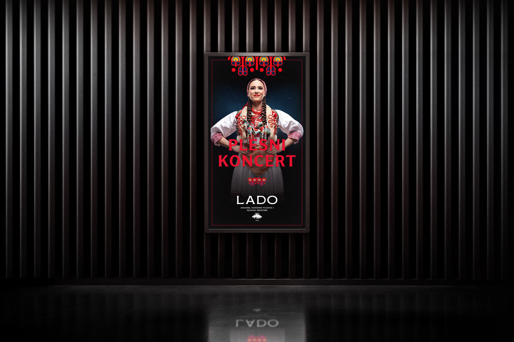
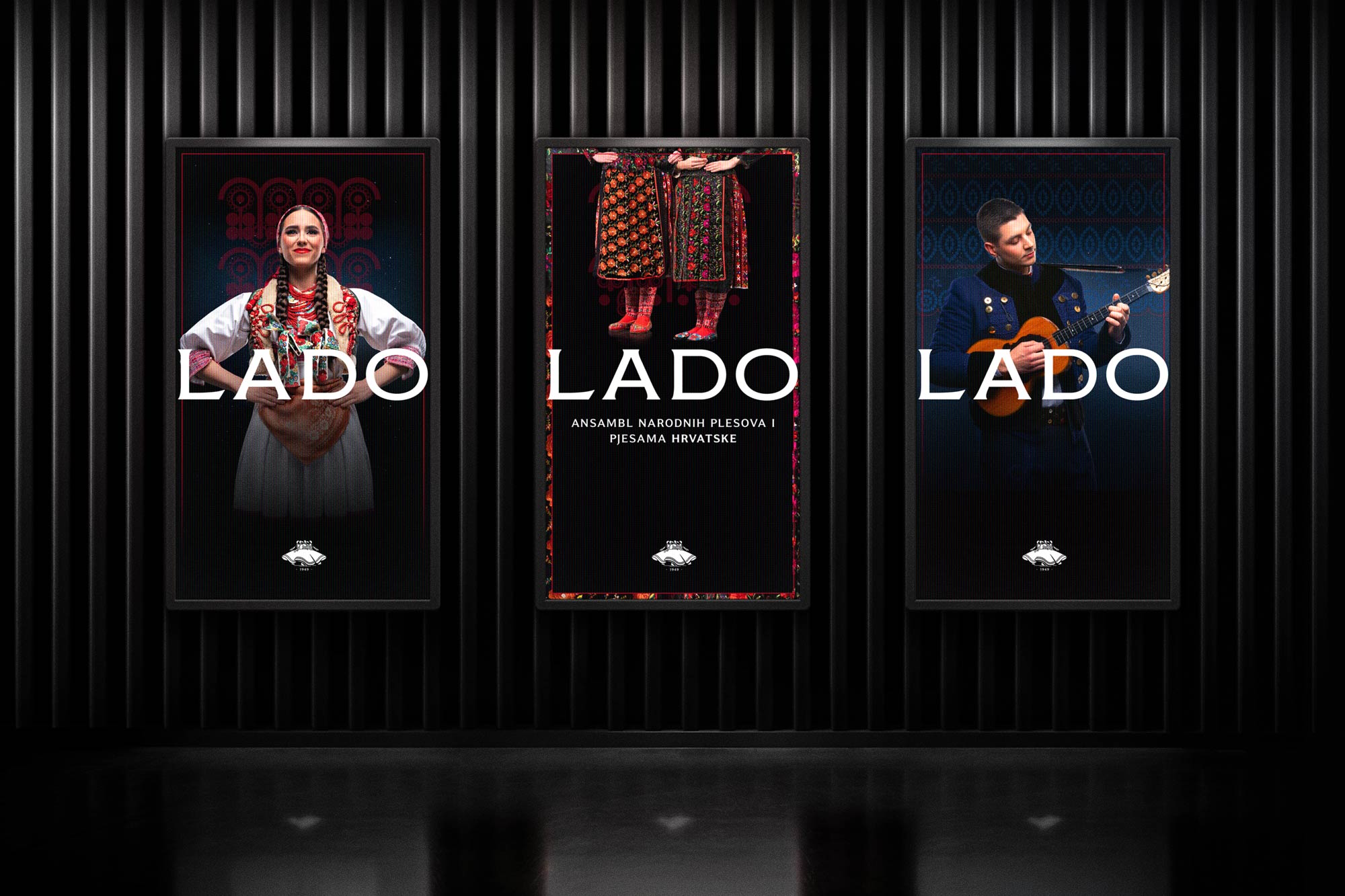
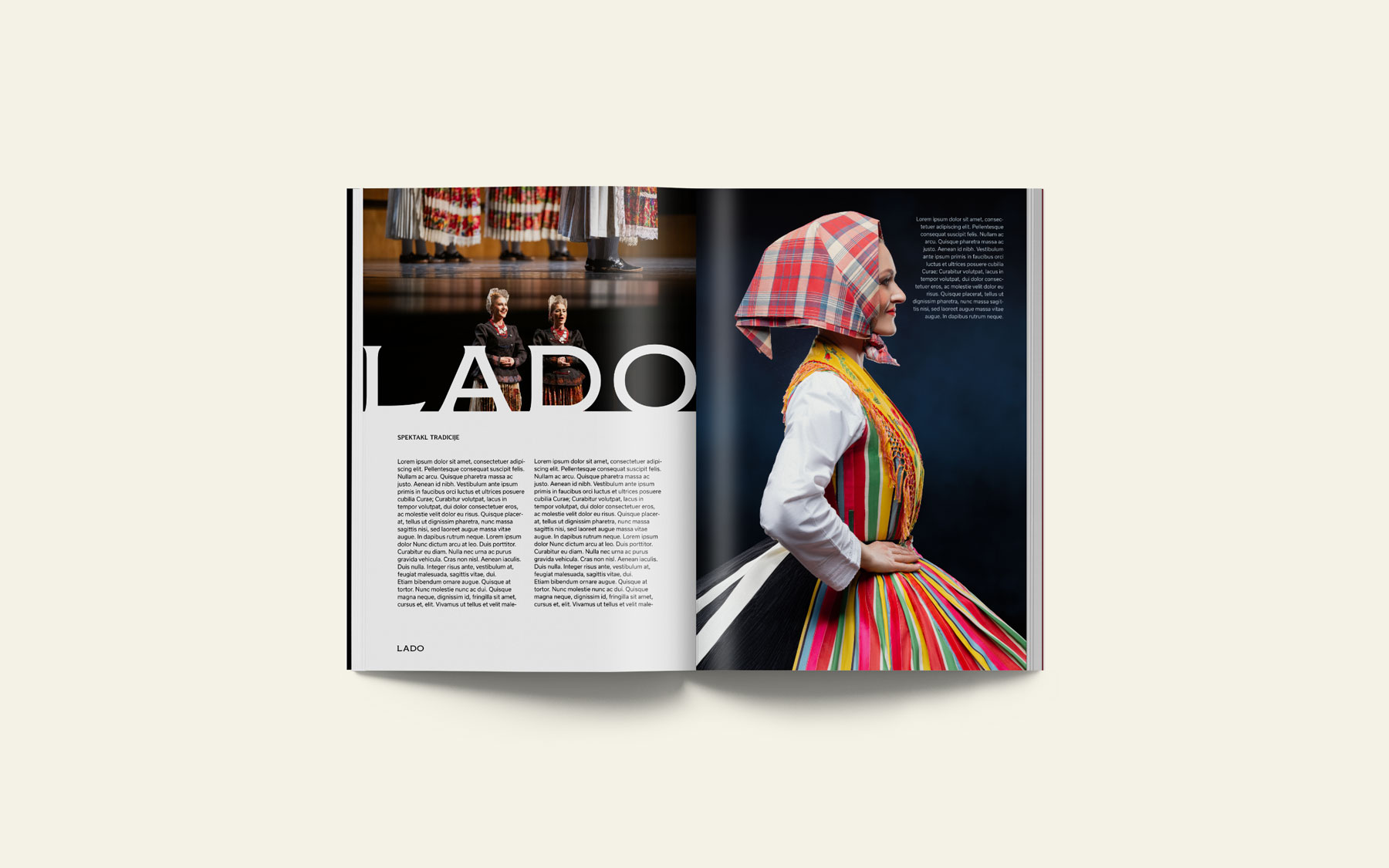
We began at the source: Lado’s archives and stage performances - the artistic core of the ensemble. We studied costumes, textures, patterns, and motifs that reflect the richness of Croatian cultural heritage. Instead of imitating folklore, we translated it into a contemporary visual language suitable for the stage, concerts, and digital environments. The focus was on a harmonious blend of spectacle, tradition, and modernity. Together with the client, we defined the brand’s key values: character, positioning, style, energy, and legacy - guiding every design decision.
Design
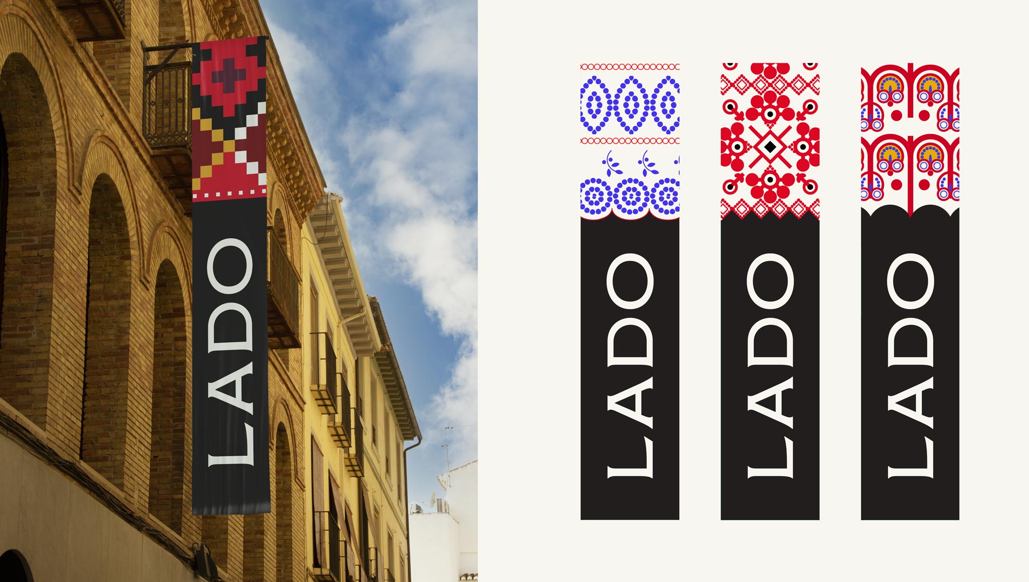
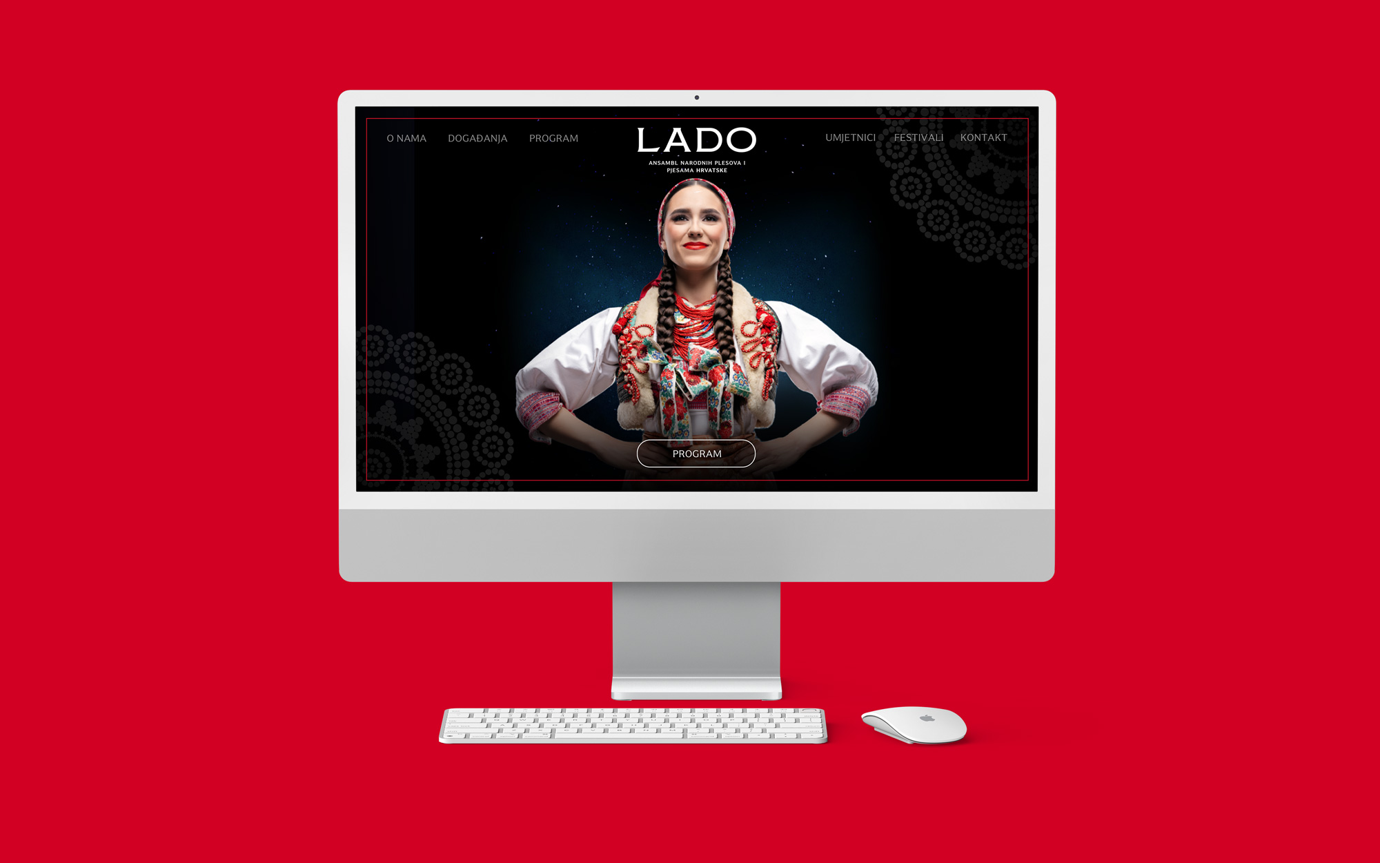
The design process involved a comprehensive modernization of Lado’s visual identity while honoring the artistic essence that has shaped the ensemble for more than seventy years. The redesign of the logotype was the starting point. The iconic motif of six dancers from the choreography “Posavski plesovi” remained central to the identity, refined and balanced for contemporary communication. Originally created in 1950, the emblem was redrawn with precise lines and stable proportions for clarity and adaptability across brand formats - from stage projections to digital media.
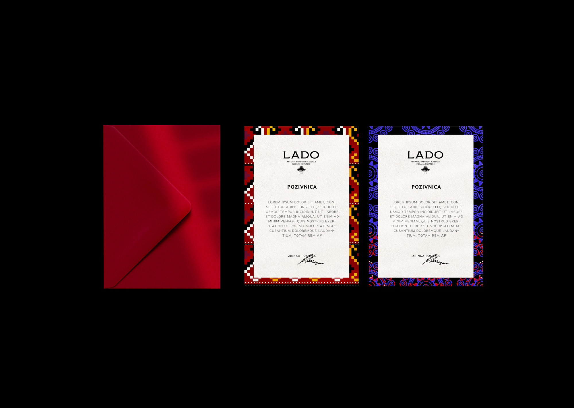
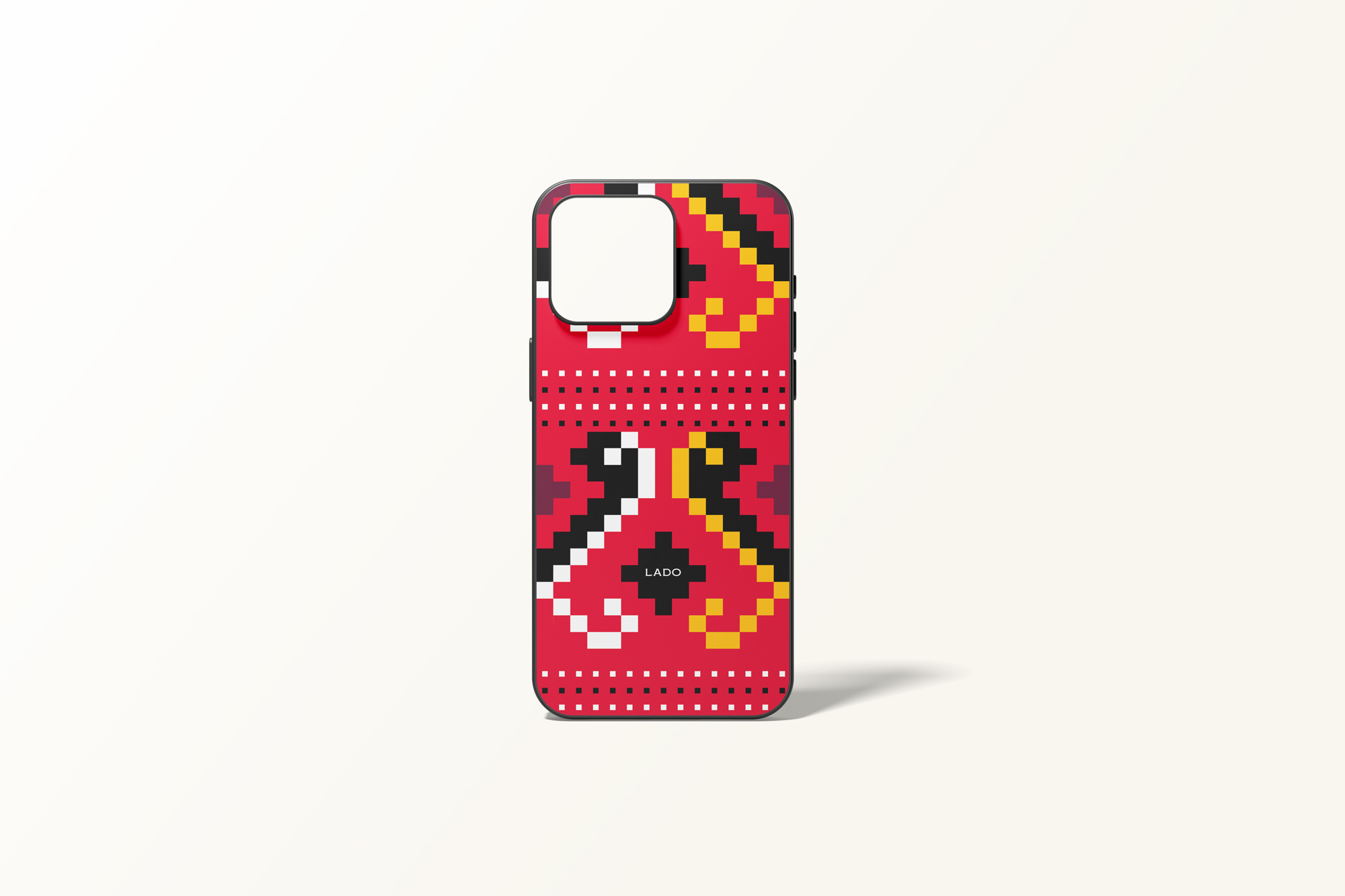
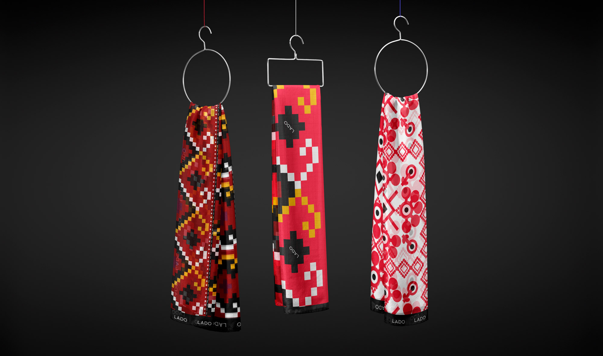
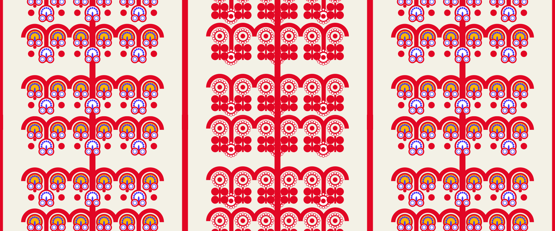
Following the logo redesign, we continued by studying archival costumes from Lika, Slavonia, Istria, the islands, Dalmatia, and other Croatian regions. Their textures, patterns, and woven structures were transformed into contemporary visual elements - modules, rhythms, and surfaces that build the brand’s distinctive identity and reflect Croatian culture. The result is a visual language that respectfully interprets tradition with clarity and coherence.
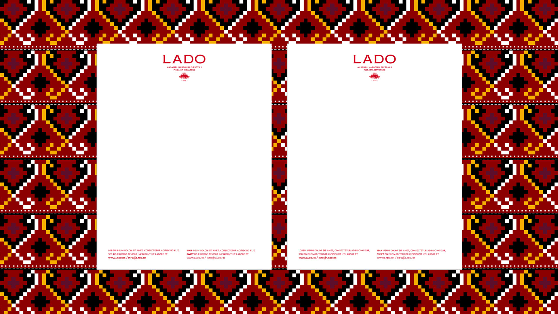
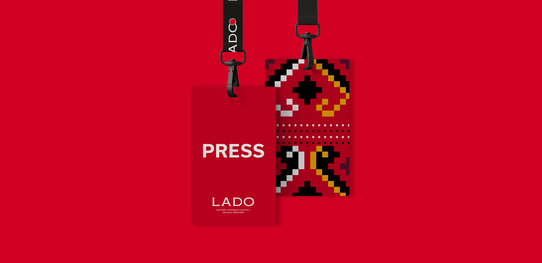
The color palette centers on a strong Croatian red as the primary identity carrier, supported by a typographic system that balances institutional authority with elegance and functional clarity across print, digital, and stage formats. The entire design system follows clear principles of composition, hierarchy, and rhythm.
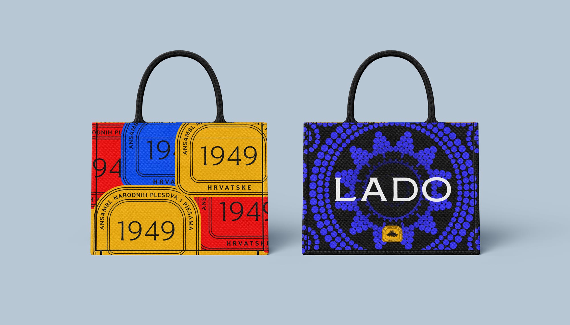
Design then transitioned into full application: visual concepts for the 2025 concert season, including the annual performance “Vode”, program booklets, printed materials, digital templates, communication assets, and a merchandising collection. Comprehensive brand standards were developed to ensure long-term visual consistency and equip Lado with a system as strong as the art it represents.


Results
Lado now communicates through a fresh, coherent, and recognizable identity where tradition is revitalized through contemporary brand design. Audiences - especially younger generations - experience folklore as a living, dynamic, and captivating performance. The institution is now equipped with a professional visual system ready for the future. The renewed brand strengthens Lado’s established cultural presence, uniting tradition with modernity, authenticity with spectacle.
